Components
A collection of reusable UI components with live demos.
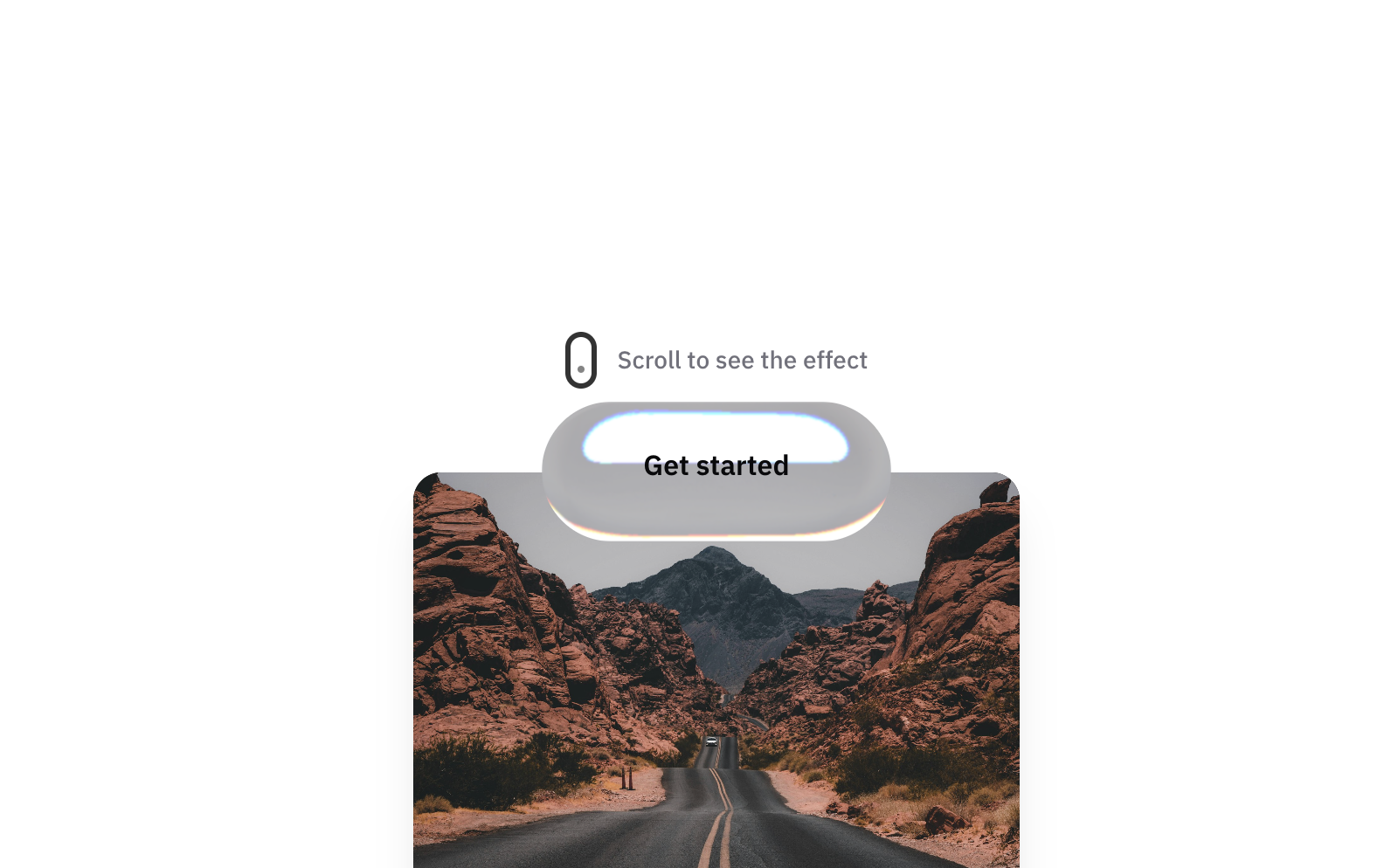
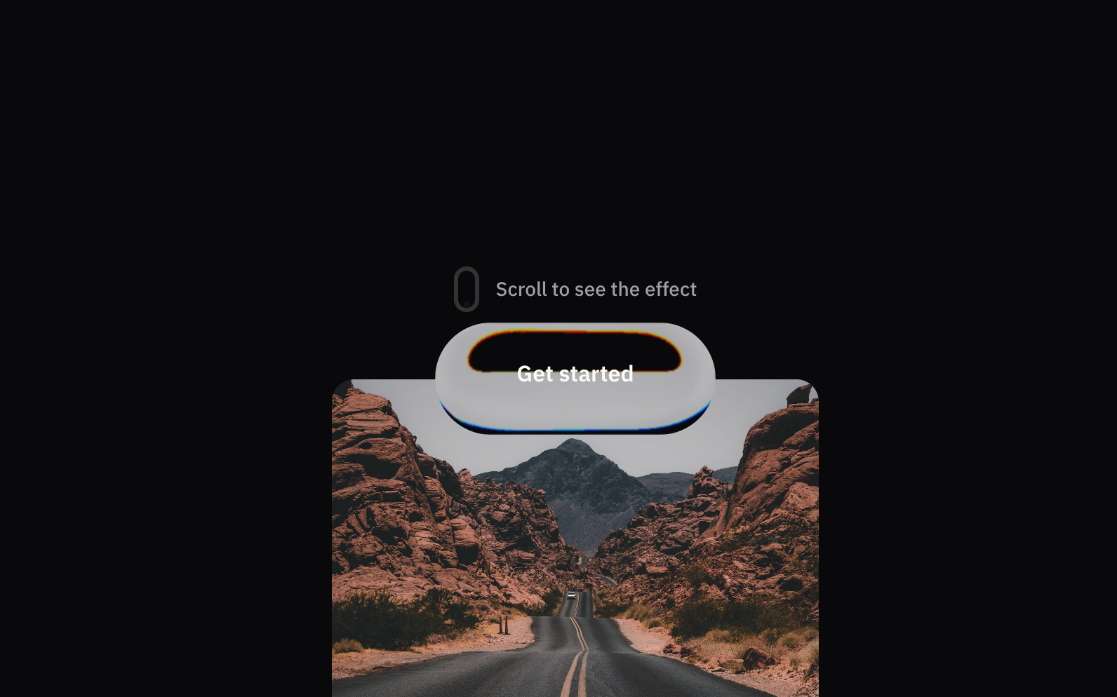
Apple Glass SurfaceNew
A glass surface component with apple-like style.
- glass
- surface
- apple
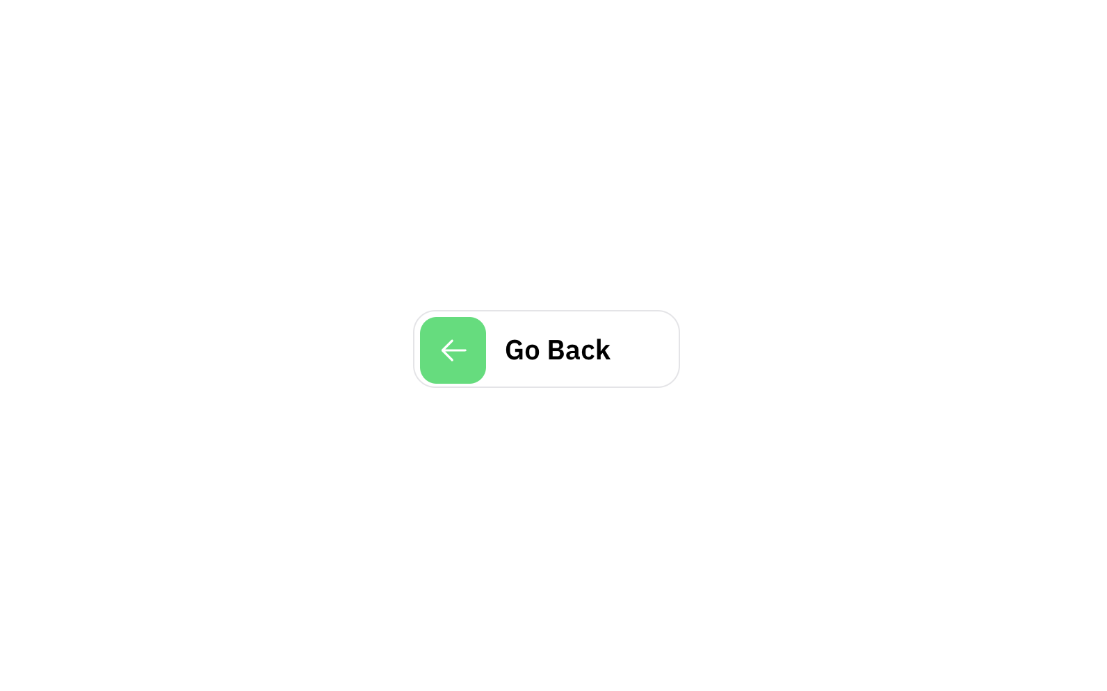
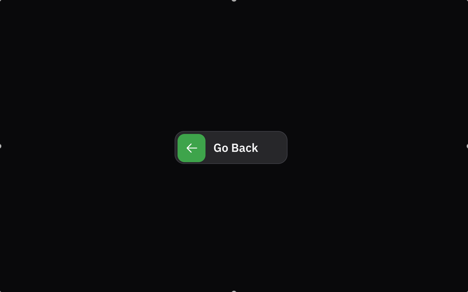
Go Back ButtonNew
A button that goes back to the previous page.
- button
- go
- back

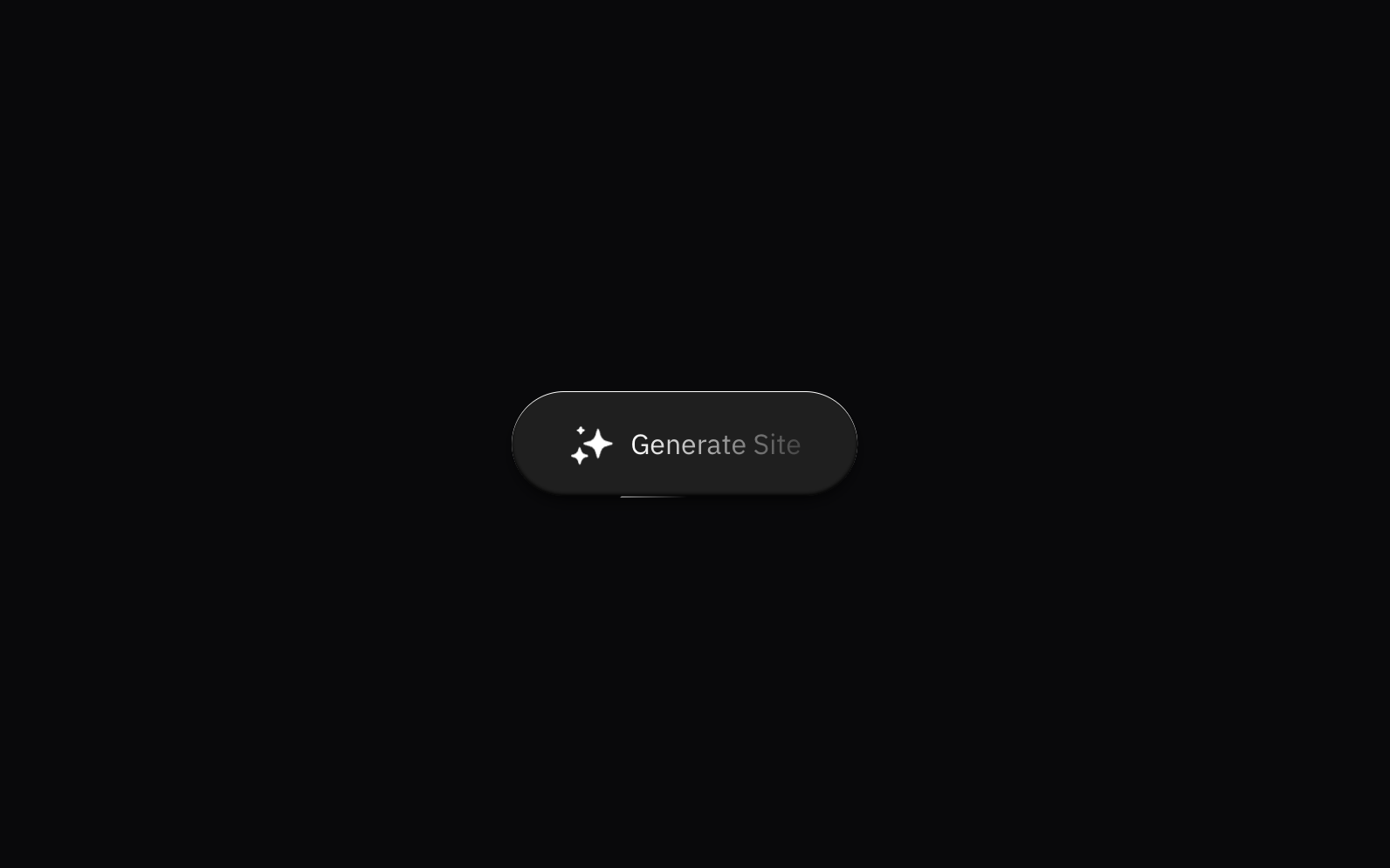
Sparkle Button
Animated button with sparkle icon and subtle hover effects.
- button
- animation
- sparkle
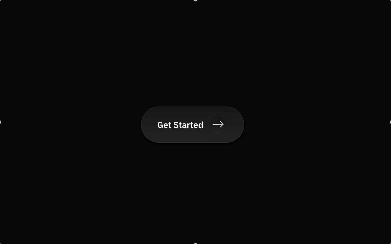
Arrow Button
Gradient button with animated arrow icon.
- button
- arrow
- gradient
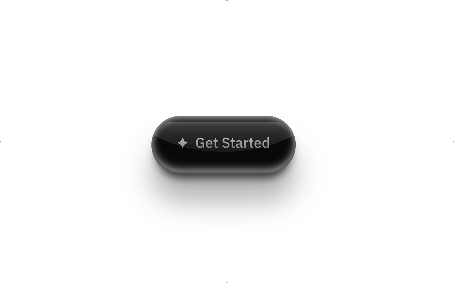
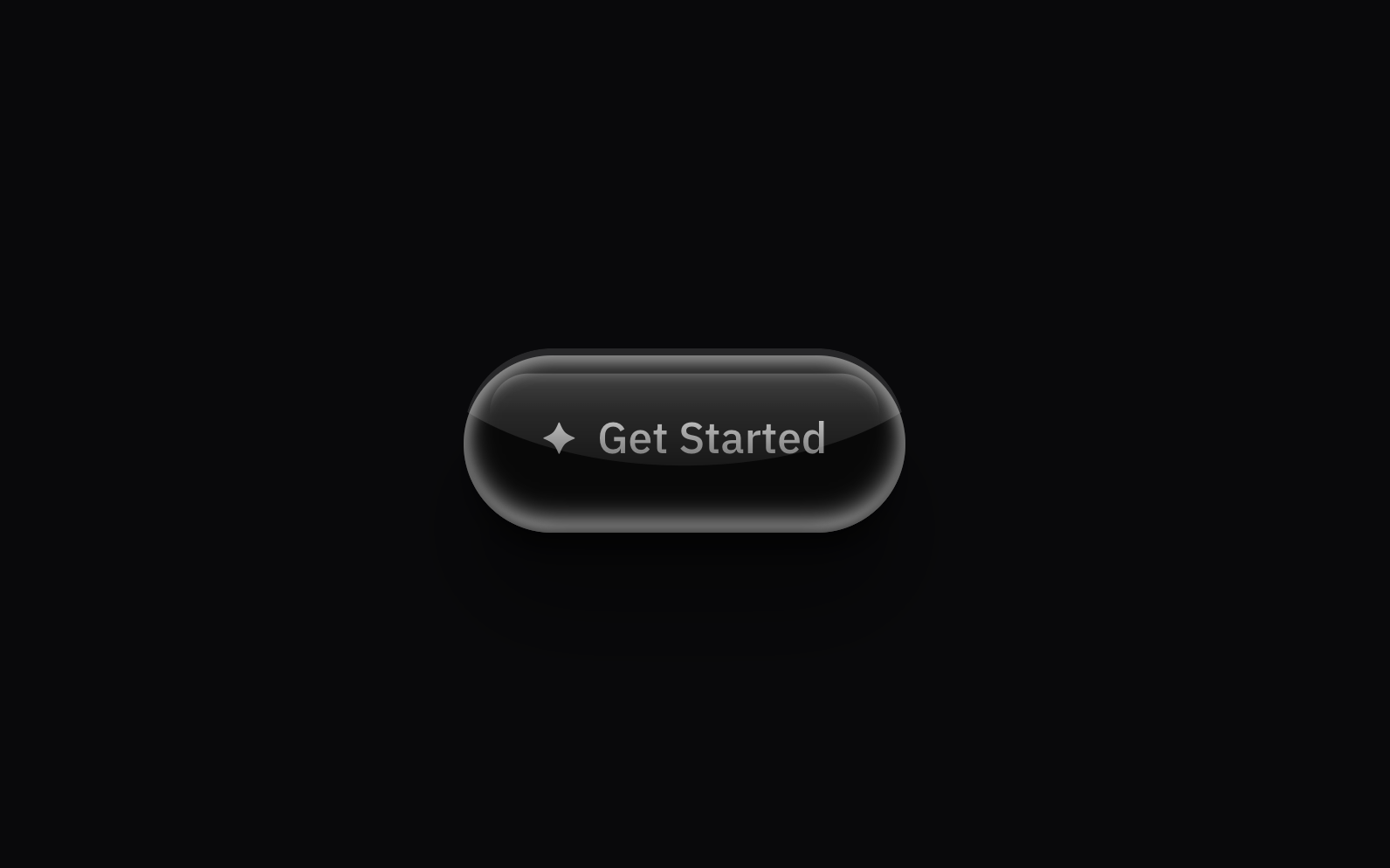
Pearl Button
Skeuomorphic button with pearl-like shine effect.
- button
- skeuomorphic
- pearl
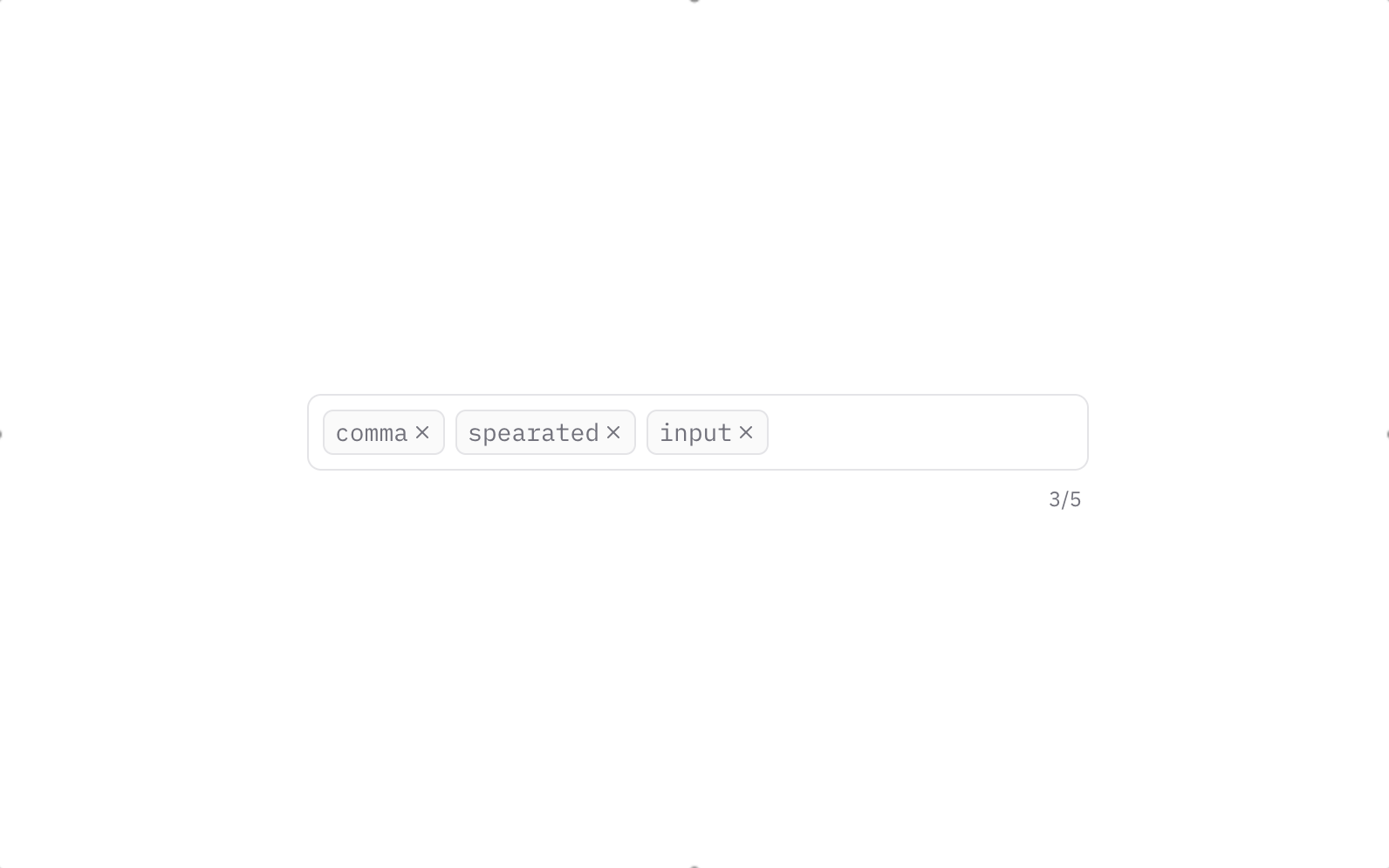
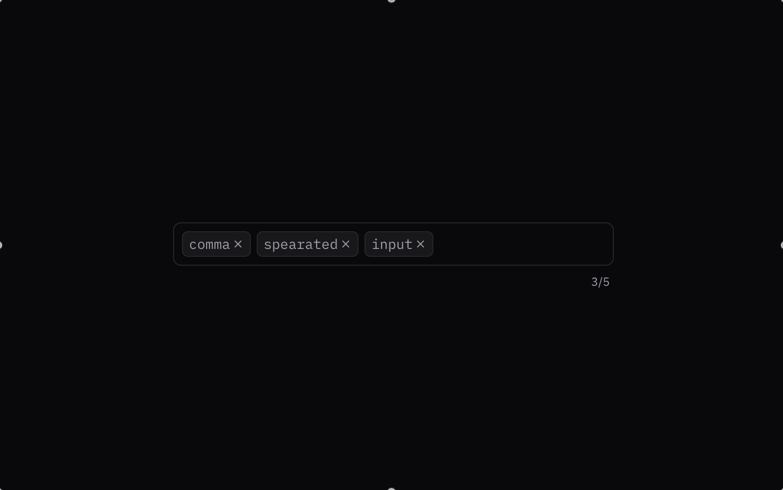
Comma Separated Input
A comma separated input component.
- input
- custom
- keywords
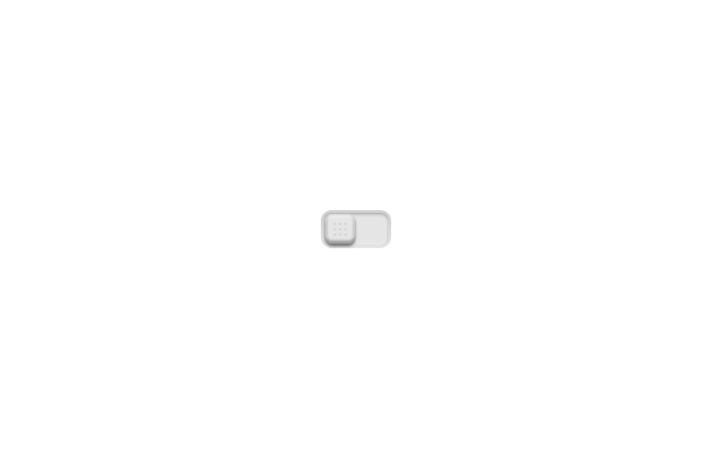
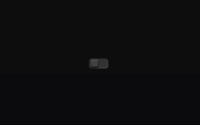
Toggle Button
A skeuomorphic toggle switch with tactile grip dots.
- toggle
- switch
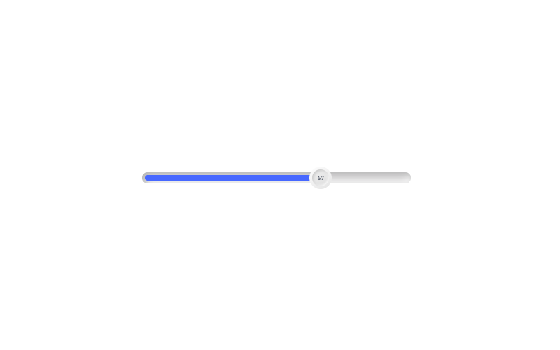
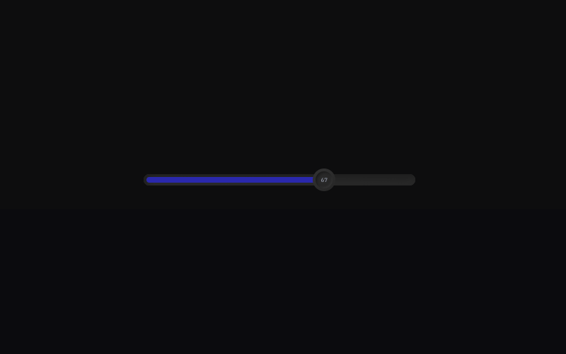
Elastic Slider
A slider component with elastic physics.
- slider
- animation
- motion